PORTFOLIO
Comfort Furniture
Comfort Furniture is a Northern Ireland–based sofa retailer dedicated to making quality comfort accessible for every budget. Working with trusted British and European manufacturers, they offer a wide range of styles without the long lead times of larger competitors.
For this project, I created a new brand identity and user experience that reflects the company’s mission of affordable comfort and approachable design, while still communicating the high quality and a sense of luxury that defines their products.
The goal was to strengthen their visual presence, improve the clarity of their offering, and build a smoother, more enjoyable customer journey.
—
Project – Brand Identity & UX
Category – Furniture Retail
Services – Branding, Identity, Web Design, UX
Ayagreen Skincare
AyaGreen Skincare is a natural face, body, and bath-care brand built on years of research into creating products that are genuinely chemical-free and powered only by botanical ingredients. After running the business for a decade and wanting to expand into a wider market, AyaGreen approached me to refresh the brand and elevate its presence.
I created a complete rebrand, including a new visual identity, leaflet and business card design, product stickers, and a redesigned website with an improved UX experience.
The aim was to communicate the purity, honesty, and effectiveness of the formulations while giving the brand a modern, refined look that supports long-term growth.
—
Project – Brand Identity & Digital Experience
Category – Natural Skincare
Services – Branding, Identity, Print Design, Web Design, UX
“Same Ideology, Different Font” is a typographic animation created for the D&AD New Blood Awards 2025, responding to the Monotype brief in collaboration with Pentagram. The challenge was to reimagine the role of typography in conversations surrounding the tension between freedom and law & order.
The animation explores this tension by visualising political unrest and the erosion of freedom under corrupt systems, using type as the main metaphor. Through contrasts, motion, imagery, and sound, the piece draws parallels between modern America and authoritarian Germany.
This project strengthened my skills in Adobe After Effects, narrative development, allowing me to create a more dramatic, engaging, and impactful message through kinetic typography.
—
Project – Typographic Animation
Category – Motion Design, Typography, Animation
Same ideology, Different font
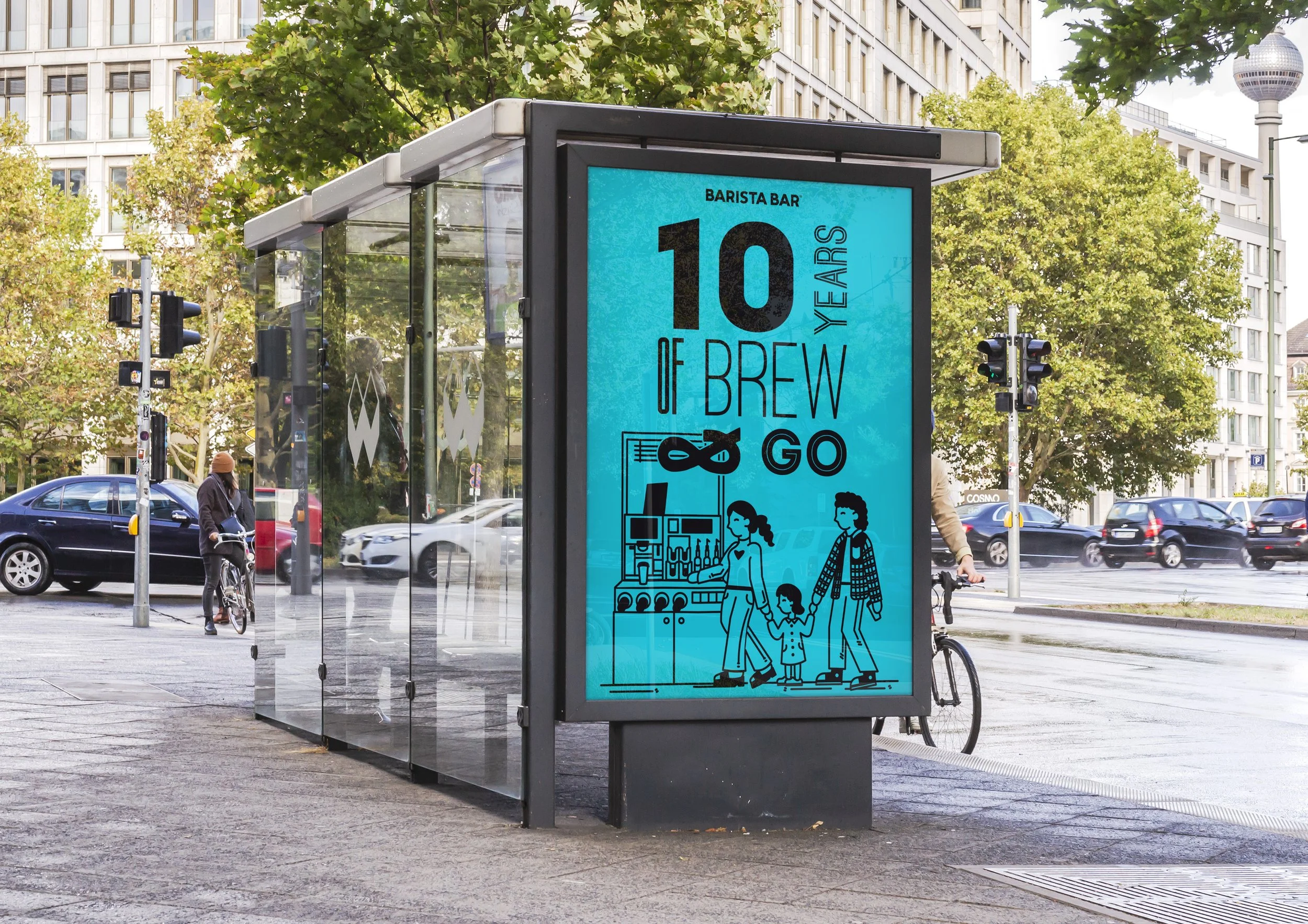
Barista Bar: 10 Year Anniversary Campaign
As part of my professional development module, I collaborated with Barista Bar to create a campaign celebrating their 10 Year Anniversary. The project included four cup designs, a reusable cup, and an out-of-home advertisement, all aimed at an 18–24-year-old audience.
This was one of my first client-focused projects, giving me hands-on experience in managing a real-life brief. I started by researching and planning ideas. I then presented these, and incorporated client feedback within tight deadlines. My campaign aimed to celebrate not just Barista Bar’s coffee, but the community and people who helped the brand grow. I used simple, playful illustrations depicting everyday moments with coffee, paired with lighthearted phrases designed to resonate with a Gen Z audience.
This project strengthened my skills in client communication, campaign design, illustration, and concept development.
—
Project – Campaign & Packaging Design
Category – Illustration, Packaging, Out-of-Home Design, Motion Graphics, Advertising
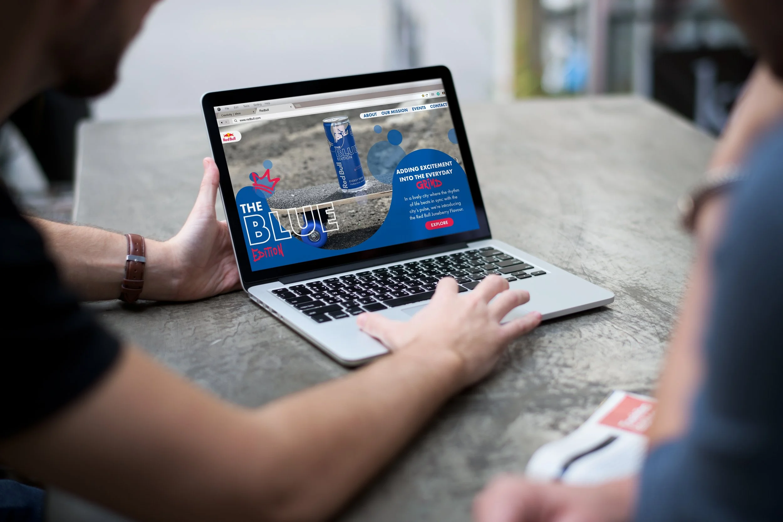
This project focused on designing a user interface for a chosen outlier product and reimagine the product for a completely different audience than usual. The challenge was to showcase the product through art-directed photography and a visual style that communicates its energy, innovation, and appeal.
I designed a user interface for a website, smartphone, and Apple Watch using Adobe XD. The style behind the design was inspired by a modern urban aesthetic in order to reposition Red Bull beyond its traditional extreme sports associations. By placing the product in a city environment, the design connects with regular working people, as well as teenagers and young adults who are interested in less extreme sports, offering a fresh perspective on how the brand can engage a broader audience.
This project strengthened my skills in UI/UX design, digital storytelling, and interface development, allowing me to create an engaging experience that merges brand identity with interactive design.
—
Project – User Interface Design
Category – UI/UX Design
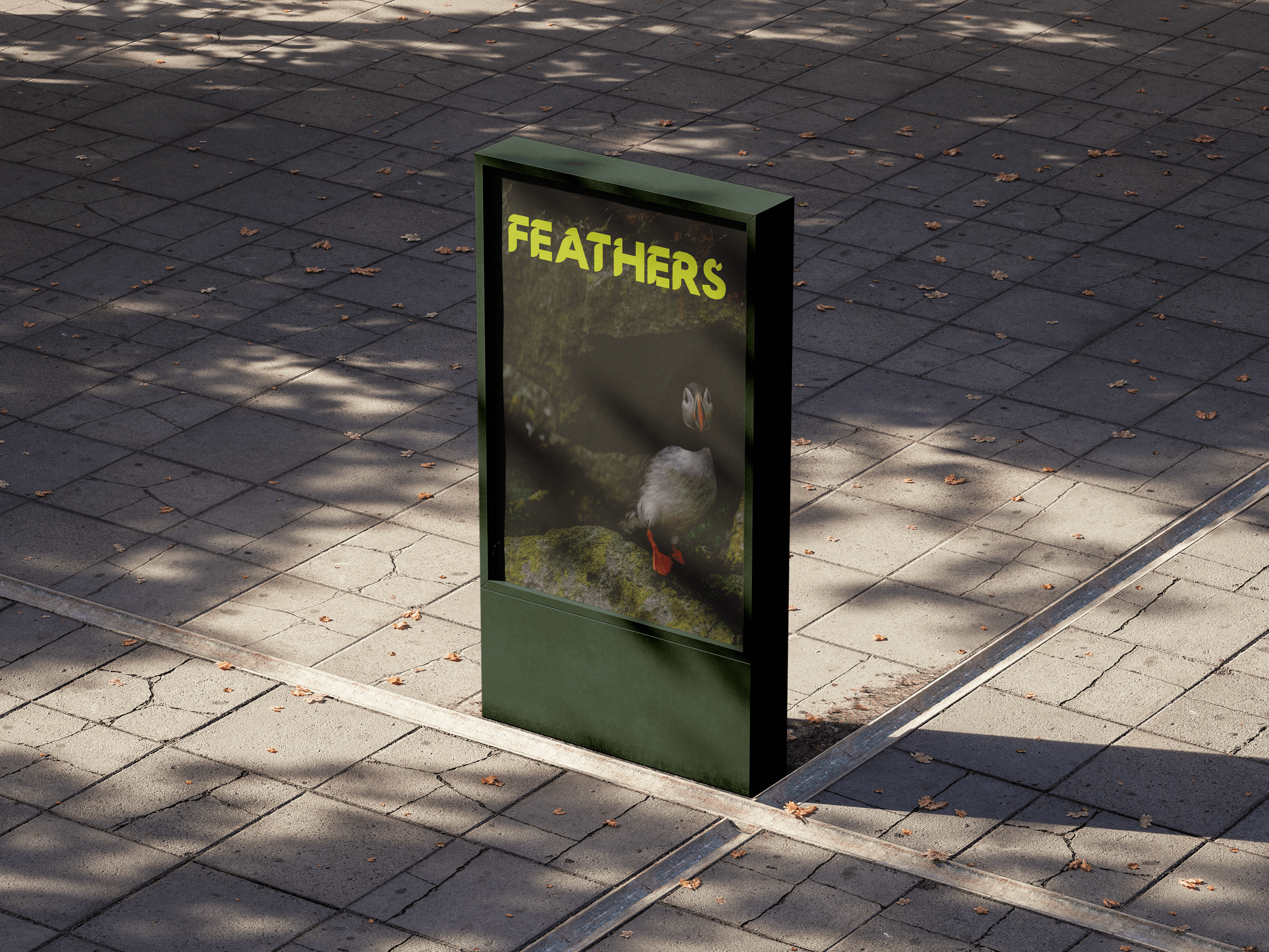
Feathers: Rathlin Island
“Feathers” is a rebrand of the former RSPB Rathlin West Light Seabird Centre, created as part of a project to celebrate Rathlin Island’s heritage while promoting sustainable tourism. This project gives the seabird centre its own identity, as it is often overshadowed by the RSPB and the West Lighthouse. The new branding highlights Rathlin’s natural beauty and the island’s diverse birdlife through a modern, welcoming visual language.
Feathers introduces visitors to local bird species and offers educational activities for schools. The website also features a livestream service that allows global audiences to observe the birds in real time, encouraging environmentally responsible engagement, while still inviting curiosity.
This project strengthened my skills in visual identity design and UI/UX development, while improving my ability to create research-driven solutions that support sustainable tourism.
—
Project – Branding and Digital Experience
Category – Visual Identity, Sustainable Tourism, Branding, Web Design
Rico Spanish Restaurant
Rico is a conceptual eco-friendly and flexitarian Spanish restaurant imagined in Belfast City Centre. The project involved visualising a full brand identity, menu card, and outdoor signage, focusing on celebrating the city’s culture, heritage, and history.
The identity blends modern Spanish culture with traditional Catalan heritage, which has been gradually fading due to past conflicts. Through visual storytelling, Rico’s brand identity highlights Barcelona’s architecture, art, and music. Every design choice, from the mosaic-inspired pattern referencing Trencadís to the Panot de Flor motifs found across city sidewalks, was made to create an authentic and culturally rich dining experience.
This project strengthened my skills in brand development, visual storytelling, and environmental design, allowing me to create and visualise a cohesive identity that merges tradition, modernity, and sustainable dining.
—
Project – Brand Identity
Category – Branding / Visual Identity, Print Design, Signage
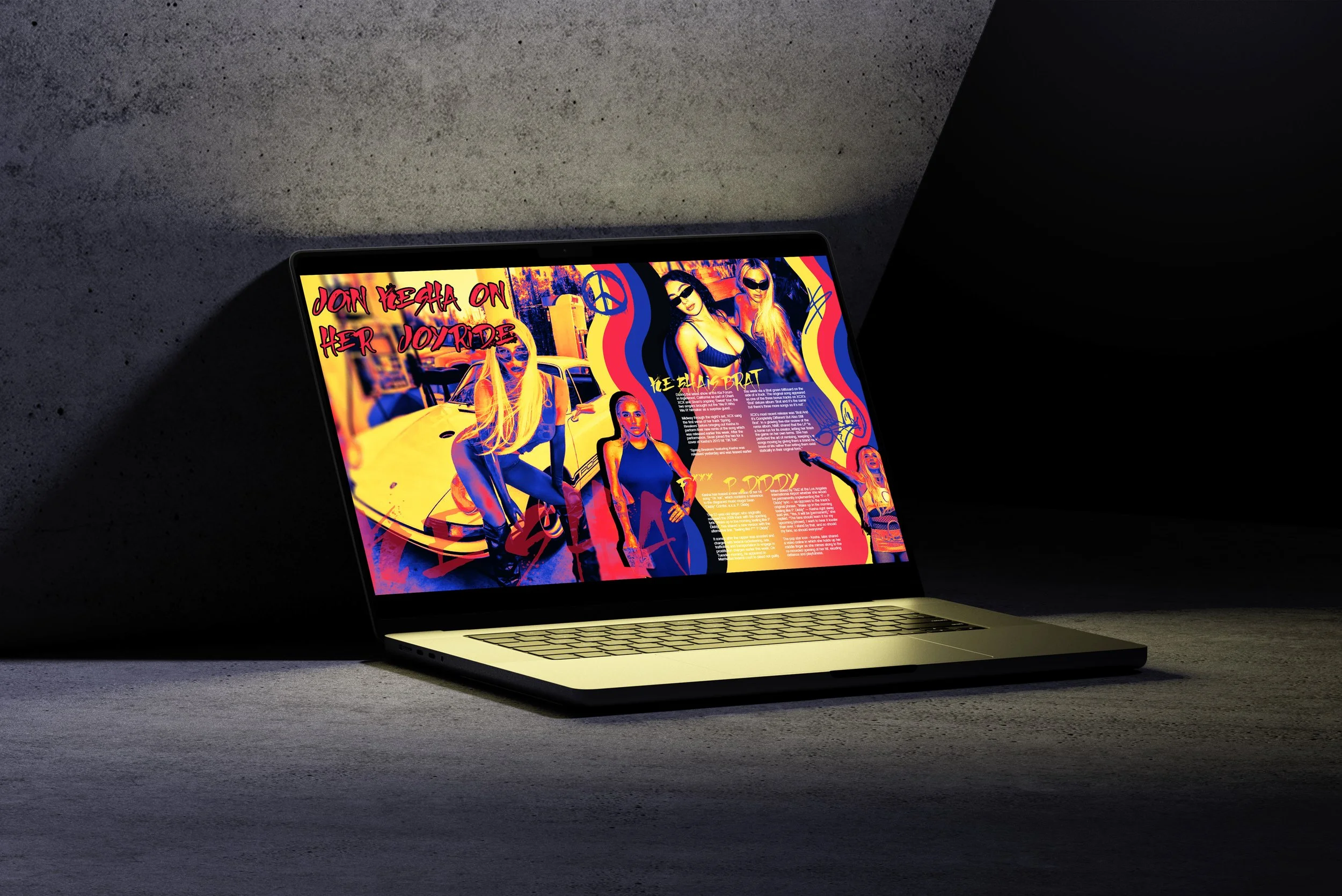
Visual Amplifier: Kesha’s Joyride
Kesha’s Joyride is a digital music magazine spread created in Adobe InDesign, inspired by Kesha’s latest music video. The project involved creating a digital magazine spread with an element of motion based on research on recent news articles based on a Music Artist. Using secondary source images, which I edited in Photoshop to create a vibrant thermal effect, I created a bold, street-style aesthetic that reflects the energy and personality of the music video.
I incorporated subtle motion elements, including a liquid gradient background behind the text, adding depth to the layout.
The project strengthened my skills in editorial design, visual storytelling, and motion graphics, allowing me to create a colourful and immersive experience that captures the essence of modern music culture.
—
Project – Editorial Design
Category – Editorial Design, Motion Design
Redbull User Interface Design
Visual Complexity: Sports Data Infographic
“Visual Complexity” is a data-visualisation project inspired by Information is Beautiful, focusing on transforming cluttered sports data into a clear and engaging visual experience. The challenge was to incorporate at least 15 separate pieces of information while maintaining readability and visual appeal.
I chose Formula 1 as the subject due to my personal interest and the amount of available race data. The Saudi Arabian Grand Prix served as the focal point, providing a timely and dynamic dataset. Using graphics, icons, and carefully considered layouts, I aimed to present complex statistics in a way that is both fun and accessible, while maintaining a strong connection to the sport’s identity.
This project strengthened my skills in data visualisation, graphic storytelling, and information design, allowing me to create an engaging, intuitive, and visually compelling experience.
—
Project – Infographic / Data Visualisation
Category – Data Visualisation, Illustration, Layout
Story to Screen: Through The Glass
“Story to Screen” was a collaborative project with BA Screen Production students, where we brought their narratives to life. Working in assigned groups, we held weekly meetings to discuss the given story’s themes, audience, and intended message.
Using scripts and storyboards as a guide, I created a melancholic poster capturing the story of a teenager forced to run away from home. The narrative follows his struggle with abuse and the difficult choice he faces between staying or leaving when a new path opens for him. I also filmed original video footage to support the visual storytelling, translating the emotional weight of the story into a compelling and unique piece.
This project strengthened my skills in narrative interpretation, visual communication, and collaborative storytelling, allowing me to convey complex emotion through design and imagery.
—
Project – Poster Design, Visual Storytelling
Category – Concept, Storyboarding, Photography, Visual Design
Editorial Design: Wo/Men at Work
“Story to Screen” was a collaborative project with BA Screen Production students, where we brought their narratives to life. Working in assigned groups, we held weekly meetings to discuss the given story’s themes, audience, and intended message.
Using scripts and storyboards as a guide, I created a melancholic poster capturing the story of a teenager forced to run away from home. The narrative follows his struggle with abuse and the difficult choice he faces between staying or leaving when a new path opens for him. I also filmed original video footage to support the visual storytelling, translating the emotional weight of the story into a compelling and unique piece.
This project strengthened my skills in narrative interpretation, visual communication, and collaborative storytelling, allowing me to convey complex emotion through design and imagery.
—
Project – Editorial Design
Category – Photography, Visual Design, Layout
Brands For Good
“Leafy’s Green House” is a brand identity project inspired by the Brink! initiative, created for a conceptual City Green Space. The concept behind my project is a W5-inspired interactive indoor and outdoor experience with a nature focus, designed primarily for children, families, and schools. Its purpose is to encourage learning through hands-on activities that support curiosity, development, and environmental awareness.
For this project, I developed a playful and approachable visual identity that reflects the centre’s educational and nature-driven mission. I presented the brand guidelines through a carousel-style format, making the system easy to navigate and visually engaging.
This project strengthened my skills in brand development, visual communication, and designing for educational and family-focused environments.
—
Project – Brand Identity Design
Category – Visual Identity, Brand Guidelines
PANI 2023: The Lawrence Trust Campaign
For the PANI Competition 2023, I collaborated with Genesis Advertising to create an awareness campaign for The Lawrence Trust, a charity supporting men and boys affected by eating disorders. Working as part of a group, we developed a poster series centred on powerful imagery of men in physically demanding, health-focused professions. The goal was to challenge stereotypes and highlight the realities of male eating disorders while educating the public about the support the charity offers.
Each poster used a play on words tailored to the imagery, reinforcing the message that eating disorders do not make men weak. This approach created a direct, impactful narrative designed to spark conversation and reduce stigma.
This project strengthened my skills in campaign development, visual messaging, teamwork, and designing for sensitive social issues.
—
Project – Awareness Campaign
Category – Poster Design, Advertising
Streets of Belfast - Donegall Quay
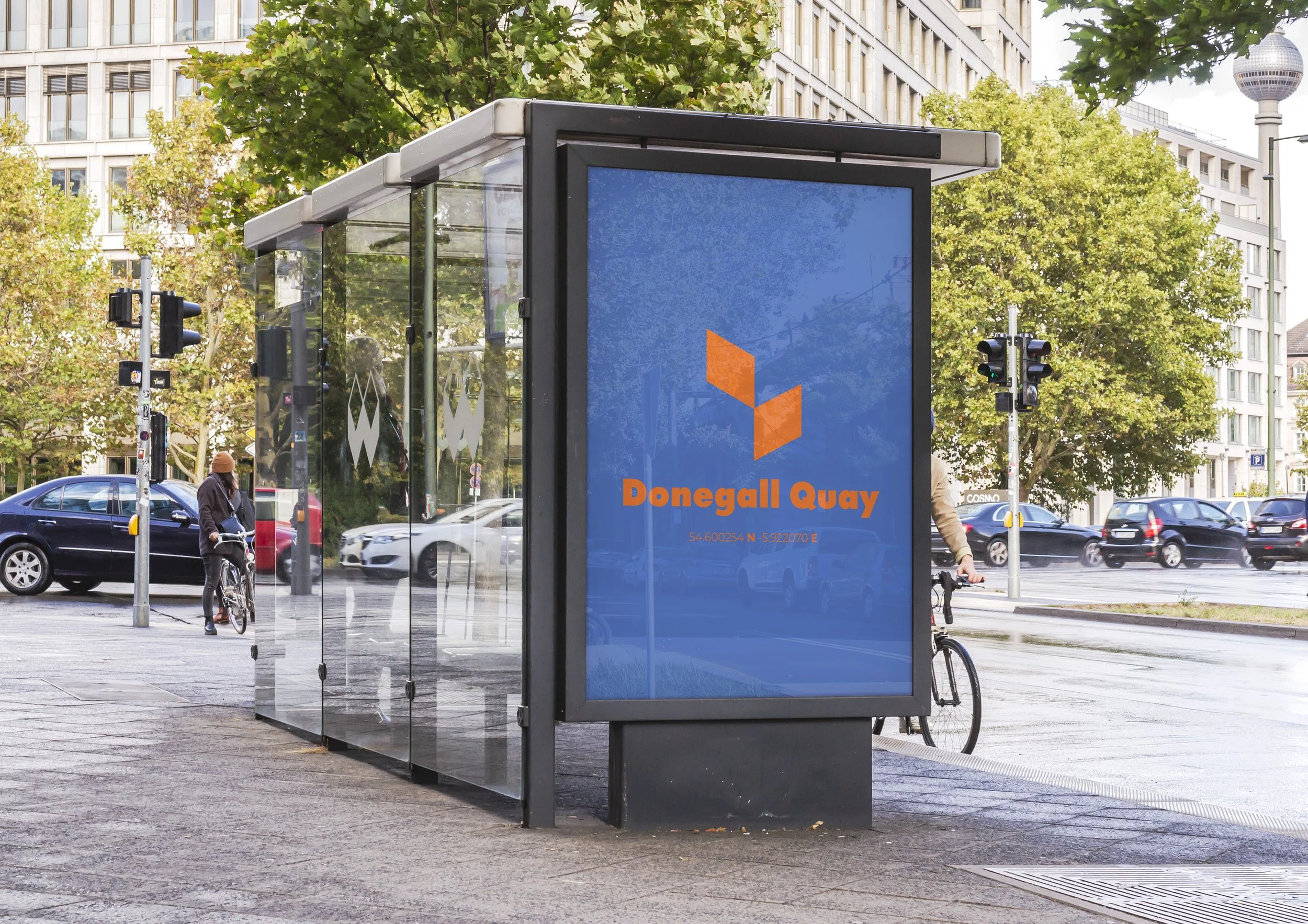
This project was a motion graphic piece designed to represent the architecture of a chosen street in Belfast. I chose Donegall Quay, as I was inspired by the geometric architecture of the City Quays Car Park. By picking out the distinctive shape from the building’s exterior, I developed a recurring motif that became the foundation of the animation.
The animation highlights Belfast’s modern architecture through motion and pattern, transforming an everyday structure into a dynamic visual experience. This project strengthened my skills in motion design, architectural interpretation, and building visual cohesion through repeated forms and movement.
—
Project – Motion Graphics
Category – Motion Design, Visual Direction, Animation, Videography
Poster Design: Belfast Arts Festival
This project involved creating an image-led A3 poster for a new Belfast Arts Festival. The brief required the design to be rooted in the centre of the city, so I chose City Hall, as I believe it is an iconic landmark, often seen as the heart of Belfast.
Using Adobe Illustrator, I illustrated the building in a simplified, shape-based style to give the poster a modern yet aesthetic feel, and to keep the focus on the festival’s celebration of arts and crafts, I also incorporated a simple paintbrush that turns into a rainbow over the city hall, to symbolise creativity and appeal to audiences of all ages.
The composition and message was inspired by a quote, “There’s always a rainbow at the end of every rain” – Prince.
—
Project – Poster Design
Category – Illustration, Poster Design
Information Design
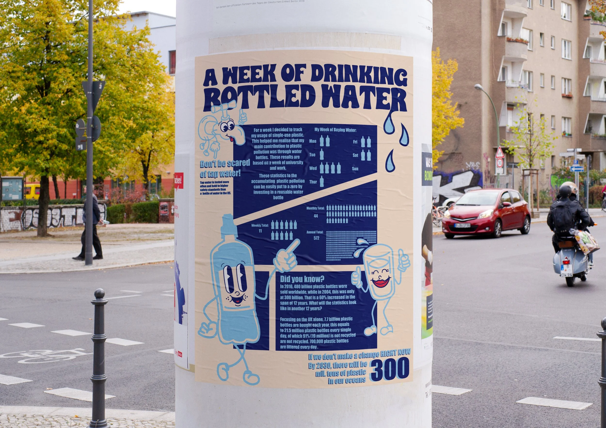
This project involved creating an infographic poster inspired by one of the UN Sustainable Development Goals. I chose SDG 12: Responsible Consumption and Production, focusing on the issue of single-use plastic pollution. Using playful characters and imagery, I documented my own experience with bottled water and translated it into a time-based narrative that highlights the long-term impact of plastic waste.
The poster encourages the audience to shift away from single-use bottles by emphasising the environmental benefits of choosing reusable alternatives. Through clear visuals and planned storytelling, the design aims to raise awareness and promote more sustainable everyday habits.
This project strengthened my skills in information design, visual communication, and transforming personal experiences into educational, audience-friendly graphics.
—
Project – Infographic Design
Category – Illustration, Layout, Poster Design
